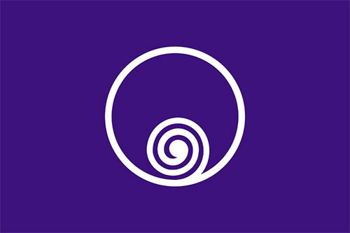
ʮ�����ҿ������ձ�������ͬ���͵��л���ơ����б�־��ƣ������������ձ�����ļ����Ʒ������Щ���ı�־���Ƿ�����������Ʊ�־���ṩһЩ˼·�������ء�������������Ӱ��ƹ�˾��Ƶı�־Ҳ������
�������ģ��ڱ�������ƹ�˾��Ҳ��ʮ�ֳ�ɫ������������Ƹ��������������ģ�ϣ����Ϊ���ṩ����ԭ�ģ�Japanese municipalities��It��s interesting to see the different symbol designs for flags of Japanese towns
and cities. Most show the same clean and uncluttered style from the Japanese flag.

��̨,������(1933)��Sendai, Miyagi (1933)

��᪸���Hida, Gifu

�������δ�(1925)��Kawasaki, Kanagawa (1925)

�㵺(1896)�� Hiroshima (1896)

������(1947)��Kitami, Hokkaido (1947)

����(1920)i, Kochi (1920)
��Ӱ���ߵµ�(1947)��Naruto, Tokushima (1947)
������ձ����б�־���б���ά���ٿ���(�ֳ�����)��
From this list of Japanese municipal flags on Wikipedia (split into regions).
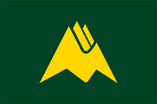
A few designs are briefly explained over on Pink Tentacle.
Biei��s symbol, for example, features the hiragana �� (bi) in the shape of Mt. Tokachi.
Kitami����
��һЩ��Ƽ�Ҫ���ͷۺ�ɫ�Ĵ���.
Biei�ķ���,����,����ƽ������(bi)����״��ʮ��
|